viva la album art!
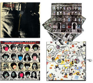
 In my opinion these are four of the best album covers of all time (click on the image to see the high res glory).
Top left: Rolling Stones, Sticky Fingers (1971) There is a legendary story behind this album cover, designed by Andy Warhol. If you want to hear it e-mail me. It's too lewd for the blog as you can probably imagine. The original album had a real zipper you could unzip like this example shows.
Bottom left: Rolling Stones. Some Girls (1978) I think this is Warhol's best album design ever -- a newspaper wig advertisement with the faces cut out and the Stones' faces on the album sleeve.
Top right: Led Zeppelin, Physical Graffiti (1975) This cover is a timeless classic. It makes great use of the die-cut like Some Girls and since it's a double album the windows, which are cut out, can have different backgrounds depending on which sleeve you put in which direction -- brilliant!
Bottom right: Led Zeppelin, Led Zeppelin III (1970) The little hand you see is pointing to the place on the album where you spin this image wheel around to make a different cover. This is another clever use of the die-cut album cover. It makes the albums three-dimensional and ever-changing.
No other decade rocked album art like the 1970's.
Comments
The Alan Parsons Project is what drove me to Techno, then Herbie Hancocks' "Rock-it" reinforce that genre.
I think the "Rock-It" ushered in the dance techno that most dance night clubs play nowadays!
bye bye
I was first introduced to "Rock It" through MTV and that video used to scare the hell out me with the robots and robotic mannequins, but in a good way like I couldn't get enough of it. It is still a brilliant video concept.
"Rock It" also paid major homage to what is now old school rap, but was then just rap, when the excellent scratching.
I like E.L.O. very much and haven't thought about The Alan Parsons Project in years. "Eye in the Sky" was one of their hits, right?
http://www.southern.com/southern/band/JUNEO/disc.html
tim g-aka Angela's worse half